Showing posts with label research. Show all posts
Showing posts with label research. Show all posts
Monday, 20 March 2017
Our New song.
After deciding that the original song we chose did not suit our opening sequence, we decided to change it. We have still kept the concept of choosing a rock song as it suits the genre, however i feel this song suits the sequence more.

Tuesday, 28 February 2017
Our Main Antagonist
For our movie we are going to need an actor to play the antagonist, we will then put the actors name in the opening sequence. We will also need to put the names of the actresses playing the mother and daughter but we will make those up.
After some research I've have some good ideas for who should play our main antagonist:
After some research I've have some good ideas for who should play our main antagonist:
- John Travolta: After seeing his role as 'Ryder' in 'The Taking Of Pelham 123' I think that John Travolta would be a perfect antagonist for our movie. In this movie we see Ryder take hostages on a train in new York and threatens to kill them if he does not get the amount of money he wants and Johns performence brings the character of Ryder to life.
- Kevin Spacey: It was Kevin's role in seven that really made me want him for this role. In Seven, Kevin plays the Psychopathic killer John Doe. The character of John Doe is not what we are looking for in our main antagonist but Kevin Spacey Performance shows that he can play an amazing bad guy.
- Vincent D'Onfrio: Vincent plays the character of Wilson Frisk in the TV series 'Daredevil'. His character would be perfect for our main antagonist.


Friday, 24 February 2017
The Playing Cards- What Do They Mean?
I've already stated that the playing cards on the clue board represent the family and the suspects, however we decided to add more to the story so the cards make more seance and so that they have a purpose. We have decided to add the fact that the main antagonist and protagonist were former best friends and used to play a card game called 'killer'. After the kidnapping occurs, Ace is left with a pack of cards and a note. The cards helps Ace know who he is looking for and Ace has to play the game again...in real life.


Tuesday, 7 February 2017
Our song for our opening sequence.
We decided to go for a rock song as it suits the action genre of the film. We got the idea from Zombieland to use a rock song as they did the same for their opening sequence. The Zombieland opening shows over the top zombie attacks whilst rock music plays over it which is a similar element we would like to use. I also like the beginning as it feels like the build up to action (someone getting ready for a mission)

Institutions
The production company may be directly responsible for fundraising for the production or may accomplish this through a parent company, partner, or private investor. It handles budgeting, scheduling, scripting, the supply with talent and resources, the organization of staff, the production itself, post-production, distribution, and marketing.Production companies are often either owned or under contract with a film studio, entertainment company, or Motion Picture Company, who act as the production company's partner or parent company. This has become known as the "studio system". They can also be mainstream, independent, or completely independent. In the case of television, a production company would serve under a television network. Production companies can work together in co-productions.
Film distribution is the process of making a movie available for viewing by an audience. This is normally the task of a professional film distributor, who would determine the marketing strategy for the film, the media by which a film is to be exhibited or made available for viewing, and who may set the release date and other matters. The film may be exhibited directly to the public either through a movie theater or television, or personal home viewing. For commercial projects, film distribution is usually accompanied by film promotion.For our film we needed a distributor and production company so our group researched different companies to suit our film. In the end, we decided to go with New Line Cinema and Warner Bros. We decided to go with these as they have produced many films that work with the genre we are using. They have helped make action comedies such as Rush Hour and Central Intelligence. Both companies are own by the same people so it makes sense that we would pick these two companies.
Friday, 3 February 2017
Opening Sequence Inspiration: Dexter
Our main character is not a psychopathic killer like Dexter, however our group was inspired by the opening sequence and want to use the same elements for ours. Just like Dexter, we want to use lots of close up shots and zoom ins. We also plan not to reveal the identity of our main character until the end of the opening sequence. Our close ups and zoom ins will set enigmas to what has happened to our character as our opening will be set after the kidnapping of our main protagonists family has happened.
Friday, 27 January 2017
Planning: Props
For our opening sequence will need many different props as our opening sequence has a lot of close ups on objects which will be used as enigmas for the audience
Props we will need are:


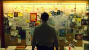

Props we will need are:
- Lifelike Gun
- Military Medals/Badges
- Family Photo
- Clue Board
- Police Badge
Planning: Character Costume
In our opening sequence the only present character will be our main protagonist. As mentioned he is a detective for the police force and he is very cocky and humorous. To be able to portray this character we will need to get a appropriate costume for our actor to wear as our character will have his own style. I've envisioned him to still look professional but have his own twist on his attire, for example, id like him to wear a shirt and tie with smart trousers and shoes which would look appropriate for his job. However, instead of wearing a smart blazer to complete the suit, he could wear a leather or bomber jacket which will show his less formal side.
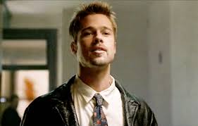
Brad Pitts Character of 'David Mills' from the movie 'Se7en' inspired me as his look shows what we would like to portray in our main character. His character in the movie is also very similar to the character we want to portray in our opening sequence. The compassion Mills exhibits translates into a overconfident or cocky behavior to the rest of the cops. Mills is a character controlled by emotion and throughout the film will show short-tempered responses. His costume helps portray the kind of person he is.David Mills wants to make a difference in the world. He fought to be assigned to a busier area, so that he could work big cases. He is dedicated and highly motivated, though a little over his head in the case depicted in Se7en. Admittedly, the film shows a once in a lifetime case, that would try any investigator. He is by nature hotheaded and impatient. He is prone to losing his temper and acting out violently when frustrated. As Sommerset puts it, he feeds off his emotions. Though this does not always serve him well, it also makes him physically courageous and a very dogged adversary. David Mills is younger and more athletic than his counterpart, and as a result he is more prone to physical action. He states that he has been involved in at least one shootout while on the job, and mentions other accomplishments. His physical stats are impressive for an essentially average guy. He engages in a long foot chase and running gun battle with John Doe in the second act of the film, and shows considerable speed and ability.
Brad Pitts Character of 'David Mills' from the movie 'Se7en' inspired me as his look shows what we would like to portray in our main character. His character in the movie is also very similar to the character we want to portray in our opening sequence. The compassion Mills exhibits translates into a overconfident or cocky behavior to the rest of the cops. Mills is a character controlled by emotion and throughout the film will show short-tempered responses. His costume helps portray the kind of person he is.David Mills wants to make a difference in the world. He fought to be assigned to a busier area, so that he could work big cases. He is dedicated and highly motivated, though a little over his head in the case depicted in Se7en. Admittedly, the film shows a once in a lifetime case, that would try any investigator. He is by nature hotheaded and impatient. He is prone to losing his temper and acting out violently when frustrated. As Sommerset puts it, he feeds off his emotions. Though this does not always serve him well, it also makes him physically courageous and a very dogged adversary. David Mills is younger and more athletic than his counterpart, and as a result he is more prone to physical action. He states that he has been involved in at least one shootout while on the job, and mentions other accomplishments. His physical stats are impressive for an essentially average guy. He engages in a long foot chase and running gun battle with John Doe in the second act of the film, and shows considerable speed and ability.
Thursday, 5 January 2017
Title Sequence Research: Zombieland.
Comedy doesn't get much blacker and darker than in Zombieland and these opening credits gloriously capture that fact. Metallica's 'For whom the bell tolls' sets the heavy metal mood while image after image of over the top zombie attacks set the tone for the wild ride that is to come for the audience. The red text represents connotations of blood which the audience will be hoping to see during the movie.During the sequence a sign that reads "the end is near" in the wide shot seen on the left gives the film an apocalyptic feel and, paired with the shot of zombie like people, suggests that a zombie apocalypse is vital to the film's plot. We also see the first name of an actor starring in it and the font used disappears off screen by burning away, conveying destruction.Another wide shot of three men and a burning car again continues the theme of anarchy and chaos as we see several notes of money launched into the air carelessly and a bloody person clashing with a riot shield, showing that this disaster is widespread and affecting all classes of people. These shots continue the idea that the narrative involves a zombie outbreak that destroys normality in this populated community.The title of the film confirms the zombie apocalypse narrative and continues the characterization of victims and zombies along with the theme of violence as we see a man smashing glass to get away from a zombie woman.
Title Sequence Research: Lord Of War
The opening Credits of the film Lord of war show the life of a single bullet, from its creation to its use which is to kill a child in a war torn country. Set entirely from the bullets eye view and set to the Buffalo Springfield song 'For what its worth' (which is used contrapuntally) , the credits set the viewer for a movie about the illegal arms trade. The white font of the text contrasts with the images of the bullets being made as the white has connotations of innocence.The font can also gives connotations of war and which relates to the title of the film and this also gives the audience an idea about what they are going to see in the movie as its suggests conflict and Russia which hints at a important part of the film.The sequence then moves to a shot of the production line, showing the metal casing of a soon to be bullet. Low key lighting, enhanced by a blue filter creates a dark atmosphere, giving off vibes which makes the audience uncomfortable. The tone of the clip represents the tone of the film, and the audience know this right from the start. The gold casing of the bullet shows the glamorous side to war, connoting the money and the power behind the act of crime; and the only light being reflected off it makes the audiences attention solely on this. This is what the film is about. The filth of the factory contrasts to the delicate copper plating running through it, reflecting the light of the factory. I can tell that the bullet is valued more than the workers or factory that makes it, they are just mules to be used and thrown away. The machine that creates the bullet has overcome the use for people, and that in the industrial struggle they are in, the bullet rules over men. The production stage of a bullet reflects the life it has, how it can start and end, just like the sequence when shot, how it can leave the barrel of the gun, and then end at its final destination; or relate to the life it has taken. The soldier who started by being trained to kill, and the end when a bullet reaches its target destination, and ends the life of its self and the soldier.
This shot introduces the camera work that has taken place, unknown to us before, we actually view the bullet in first person, giving it an identity, and forcing the viewer to forge a relationship with the bullet. this gives us a much more in depth understanding of the power it holds, as you see the delicate process that takes place. The metallic gold color shows the struggle between good and evil, as the contrast of the factory, just like before, represents the cold war that is taking place, and the effect it has on the world. The title 'LORD of WAR' comes on the screen, instantly confirming to the audience that this is actually about war, and not just a common relation with the term 'war', just like many films are. The size of the text is over shadowed by the presence of the bullet, towering over the letters, stating authority. The font isn't fancy. It doesn't need to be, the words that it says is just enough. It has no point to prove, and no means to over complicate the mise-en-scene of the shot.
The angle the bullet is pointing in the next shot proves the point of destruction. We see workers working the production line, making sure every bullet is perfect enough to kill. Its this deadly accuracy, and precision that makes these weapons the most destructive in the world, killing more people than any other. Numerous bullets flood the line, showing the mass scale of the operation. Sparks fly from machinery connoting the death and mayhem they create. The light passing through the window high lights the open world, and how these weapons are going to be released upon it. It also shows how poverty can affect the way people need jobs. The workers in this scene wont earn much, and I doubt their doing it for the passion of making bullet's. During war people are forced to do things they wouldn't normally do, making them at the mercy of their bosses and ranking officers, and especially in the production of weapons, they do not hesitate to eliminate you if you do not do a good job.
Title Sequence Research: The Shining.
The opening setting may seem like a holiday, but The Shining's destination is no vacation. The omniscient overhead camerawork and ominous soundtrack soon tell the audience that the people in the car we are following are in big trouble.The long shots show that there is no civilization for miles which puts the main characters at risk when seeking help as it will be impossible to find it, Even the ice blue credits scrolling across the screen can seem haunting as it can symbolize cold heartedness and evil. The destination is then revealed and seems to be a mansion sized house which can be big enough to get lost in. From this the audience can tell that a lot of stuff will go on in that house.
Genre Film Case Studies
For our fiction film opening scene, i would like our group to create a film with the genre action-comedy.To show that i know the conventions im going to work with, i have studied 2 films of this genre. These 2 films are Central Intelligence (2016) and Deadpool (2016).
'Central Intelligence' Rawson Marshall Thurber (2016):
-Setting: The setting of this scene is in a tall building full of offices where wealthy people would work. Money and high expensiveness is usual convention seen in action films and the audience will know that the people working in the setting are most likely to be highly paid. As the scene plays out, much of the setting is destroyed by the guns being shot and the fighting. The audience will expect to see this as damaging of expensive items is another convention of action.
- Iconography: Action films tend to have some sort of iconography such as gadgets, guns and expensive suits etc. and all of these can be seen in this scene. In action comedies, the weapons used can seem quite over the top or very irregular, for example in this scene Bob Stone (Dwayne Johnson) uses a Banana to help defeat the man he is fighting. Also the clothing the characters are wearing make them look smart and professional, however, Bob Stone seems to be the toughest guy in this scene and is known to be a CIA member but his clothes do not make him seem smart and professional at all which can seem humorous. This is an an example of hyper-masculinity for Dwayne Johnsons character.
-Character: Generic Characters in action-comedy can become traditional action heroes. The main characters in action-comedy can usually be partners and this can be seen in films such as 'Bad Boys, Hot Fuzz and 21 jump street,(buddy films) a partnership also takes place in this film between Bob Stone and Calvin Joyner (Kevin Hart). there is usually many faults and differences about the 2 characters which can make the relationship comical for the audience and this can be seen with the 2 main chracters of this film.
-Narrative: The opening of many action comedies show how the two characters got to know each other. The begin of this movie shows the 2 characters during there time in high school. Calvin was a extremely popular student who was loved by everyone but Bob was very unpopular and was embarrassed in front of everyone as he thrown out naked in front of the whole school during an assembly. Calvin felt bad for bob so he handed him his jacket to help him. Bob then contacts him later in life and they meet up which is where the partnership begins to start.
'Deadpool' Tim Miller (2016):
-Setting: The setting of this scene takes place on a motorway in a big city. A city is usually a ideal setting for a action movie and the motorway has potential in producing many conventions such as high destruction. This also puts many innocent people who live in the city at danger.
-iconography: Weapons are a common iconography in action movies. The character of Deadpool shows this as the audience can see the wide range of weapons he has on him such as a gun and two huge swords on his back. This makes deadpool look as if he is ready to kill, which is unusual for a superhero movie. The car chase and fight show more conventions of action, however deadpool seems to not be taking the moment seriously as he fights the antagonists which makes the scene more comical.
-Character: As mentioned, Deadpools character does not seem to take serious moments seriously, when in fights he can give funny one liners and has attitude as if there is no fight going on at all. This shows that he if very comfortable when fighting and shows that he is used to it. His character is alos betrayed as a anti-hero which contrasts with the genre of the film having a sub-genre of a superhero movie.
-Narrative: The film is about the character of Wade Wilson (Ryan Reynolds) who has fond out that he has late stages of cancer after finding the love of his life. He is told that he can be cured however it turns out to have haunting side effects, even though he is now immortal, Wade has been left with terrible mutated skin. Therefore, before returning to his girlfriend he must find the man that done this to him, Francis, who can allegedly turn him back to normal.
-Narrative: The film is about the character of Wade Wilson (Ryan Reynolds) who has fond out that he has late stages of cancer after finding the love of his life. He is told that he can be cured however it turns out to have haunting side effects, even though he is now immortal, Wade has been left with terrible mutated skin. Therefore, before returning to his girlfriend he must find the man that done this to him, Francis, who can allegedly turn him back to normal.
The Art of the Title Sequence
Titles In Silent Film
Words and lettering played an enormous role in films of the silent era. Film titles made their appearance in the earliest silent films, along with letter cards (or inter-titles), which provided context. These cards were the responsibility of the lettering artist, who collaborated with the scriptwriter and director to create narrative continuity so that audiences could follow what they were seeing. Distinct from these inter-titles was the film’s main title, a vehicle of particular concern to film producers because of the legal, copyright and marketing information this footage had to bear.
From this part of the article, i have learned that words and lettering were very significant in telling the story and providing context in silent films due to the fact that they had no sound. I found this interesting as we don't see this today because we have the technology to produce sound and tell a story, however, in the silent era the lettering artist, the scriptwriter and the director had to come together to create the right text to make sure that the film made sense for the audience. This would mean that if the text was not there or did not make sense,the whole film would fail and the audience will not understand the narrative plot.
A great draftsman and visual storyteller, Saul Bass ran the gamut of techniques for his title sequences: montage, live action, cut-out paper animation, typography in motion, to name a few. Whatever technique he used, Bass summarized the film as a metaphor that often shone with creativity. (In January 2010, David Peters, Kai Christmann and Dav Rauch, all of Design Films, gave two presentations on the work of Saul Bass at the 12th Future Film Festival in Bologna, Italy.)
I find this part interesting as it tells me that Saul Bass is one of the first to use many techniques such as montages, live action and cut-out paper animation in his title sequences and they ''often shone with creativity.'' He inspired many of today's film makers and has had a massive impact on films and there title sequences.
The Digital Era, And Modern Trends In Film Title Design
Every sphere of contemporary life — and especially the film business — has been affected by computers. For designers, creating film titles meant participating in the apprenticeship tradition — learning by doing, on the job; that continued unabated into the mid-1990s. At that time, dynamic openers by Kyle Cooper and others showed what the next generation of design-educated, film-literate, tech-savvy creatives could do. That apprenticeship tradition has largely been overshadowed by the rise of popular technology, the Internet-enabled archiving of everything and the plethora of schools that propagate countless design disciplines. Most significantly, we see designers working like filmmakers and filmmakers working like designers.
This part of the article tells me that technology has had a vast impact on the film business since the digital era began, it would allow designers to find new techniques to make there title sequences better. People such as Kyle Cooper were able to show the next generation of film creators what they could do and helped make films what they are today using the technology provided. However, today technology has taken over apprenticeships in the film business as it has lead to filmmaking and designing come into one job, and has made less opportunities for a new generation of film creators.
The potential of digital graphics and typography has attracted some of the most creative minds to motion design. Pixar and Disney have reserved crucial parts in the branding of their films for the title sequences. Using animated characters to introduce viewers to the story became a popular trend. Such talented graphic designers as Susan Bradley (Toy Story, Monsters, Inc., WALL-E, Ratatouille), Jaimi Caliri (Lemony Snicket’s A Series of Unfortunate Events), Dave Nalle (Corpse Bride), Michael Riley (The Back-Up Plan, Kung Fu Panda) and Michael Curtis (Brother Bear) use all manner of tools to test different approaches to designing titles. One thing these individuals have in common is a drive to find a strong metaphor and tell an exciting story with their sequences.
Some of the biggest companies such as Disney and Pixar have used their title sequences to make their movies more successful and recognisable. They would introduce the audience to the characters and tell a story to get the audience interested. Designers such as Susan Bradley, Dave Nalle and Micheal Curtis are all successful graphic designers for Disney and Pixar but all have their differences when creating their titles. However they all are able to tell a story which draws the audience into the story even more as their sequences are perfect.
Reconnaissance


Here are our images from our chosen location for our opening sequence. We are going to film most of our opening sequence in the bedroom, then when the main character goes down stairs we will mainly film the rest in the kitchen. Areas such as the the kitchen and bedroom were quite small which would mean that we would need to work out where we would put the cameras to try to get the best angles and shots.


Subscribe to:
Posts (Atom)